Project Description
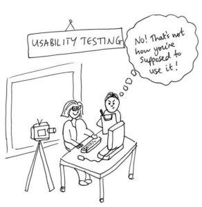
This usability testing resulted in a report which outlined test findings identified. Usability testing was performed by conducting task scenarios with users on the shop.wwf.ca website. The tests were performed on both desktop and mobile versions of the website for optimal results, and solutions were proposed to help solve the critical and major issues that were found.
The following was done in order to plan for the testing sessions:
- Identification of the research objectives
- The approach, methodology and goals were determined
- The logistics were planned for
- Test results were logged based on severity and count
- Conclusion

After redesigning their website 3 years ago, traffic on website has generally shifted from being primarily desktop driven to being primarily mobile driven.
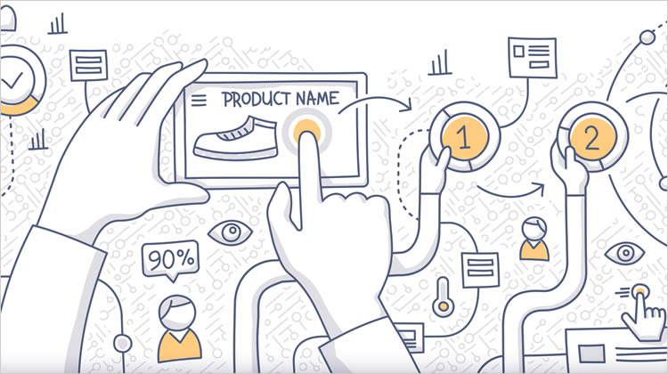
Business objective: The purpose of the usability study was to identify issues faced by users today in order to fix the the website for better traffic.
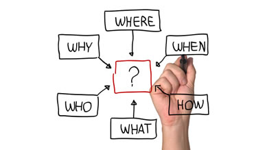
Usability research objective: The objective of the usability tests was to uncover issues encountered by users when navigating the WWF shop website.
- Exploration: overall navigation of the website – information architecture and taxonomy issues.
- Search and path to purchase: ability to find a specified product and purchase it – user flow, UI, copywriting.
- Card product: shopping experience when purchasing a card (vs as another type of product) – interaction and user flow.
- Policies and FAQ: test ease of navigation when the user is looking for policies or FAQs – interaction, user flow and copy.
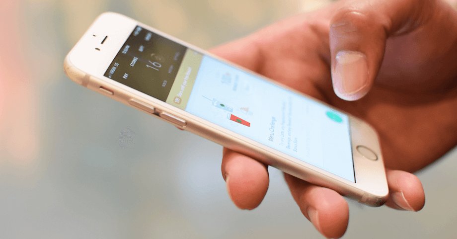
Three one-hour sessions were conducted with three participants, and included five tasks. Of these, three tasks were conducted on an iPhone to test out the mobile version of the site with the remainder on desktop version. All interviews were completed in English.
Example of a task:
Task Scenario #2 – Testing “Path to purchase, filters, personalization”
Your child’s birthday is coming up, and getting a pet has been top of mind for THEM despite your reluctance. On the WWF-Canada shop website, find a way to fulfill that cuddly need (without bringing home a puppy) and add it to your cart.
- The task scenarios written to frame and address the issues outlined in the research objectives. These tasks also help ensure alignment with WWF’s organizational goals and strategic objectives.
- After defining the desired characteristics of the test subjects, a screener was created and shared – the purpose was to help filter out respondents that didn’t align with the preferred respondent criteria.
- Usability test plan to plan logistics: waiver forms, confirm participation, testing schedule, technology equipment required, roles during the process, snacks, renumeration.
- Room set up
- Welcome
- Ice-breaker / warm-up
- Moderating the task scenarios based test session (note-taking in parallel by a team member)
- Post-interview
- Thank you
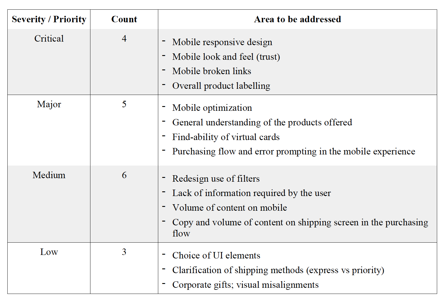
A considerable number of critical and major issues were identified, which mapped to design areas to be addressed (see table in image above).
Conclusion
Positives: The respondents were mostly able to complete the task scenarios with the exception of a few tasks on the mobile site. A total of 18 issues were found with the majority of them ranging in the major and medium severity. There was still a considerable amount of critical issues (22%) mostly related to information architecture as well as the mobile experience. Overall, finding navigating to policies or FAQs was very easy for all users. The comments for these tasks were mostly around the copy – most of it was content heavy and difficult to skim through.
Negatives: The difference between products wasn’t very clear to users – what is the difference between Wildlife adoption v.s. Virtual gift? In addition, the mobile experience caused a lot of frustration and caused trust issues.
Questions: In the post-task interviews, findings also revealed that there was a lack of information around WWF – how is the money spent based on the donations? Where can the users find general information on WWF without leaving the “shop” website?
Next steps recommendations: Some consideration should be given to redesign the mobile version of the website in order to fix broken links and make it more digestible for users. Overall, the taxonomy of the website and categorization of the products should also be revised for both mobile and desktop. A tree-test or card sorting workshop with users can be used to design a more intuitive and user friendly IA. Once updates are made, another round of usability testing should be conducted on the mobile and desktop versions of the website.
EXPLORE MORE PROJECTS ON MY PORTFOLIO!